BONES.zip (2024)
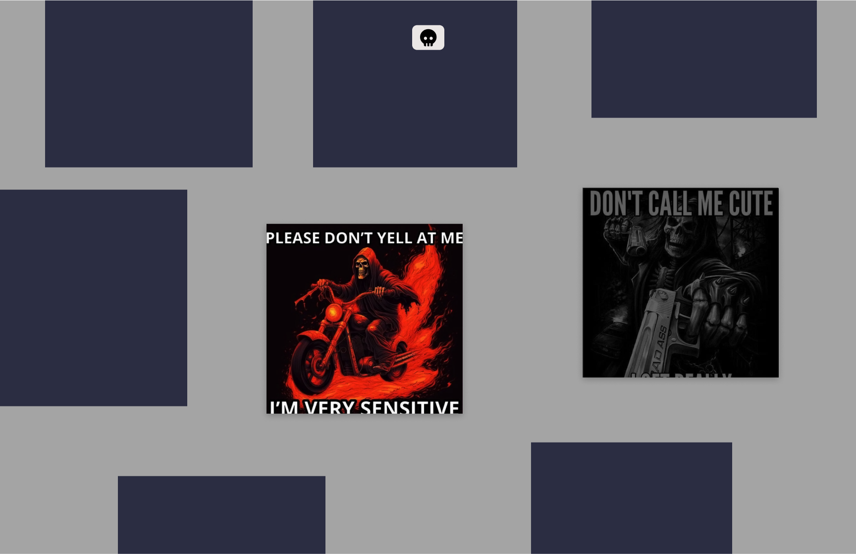
My first figma website prototype attempt for an archive project. I wanted to present skeleton memes, one of my favorite meme subgenre. It’s spooky, sarcastic, funny, deadpan… it’s perfect.
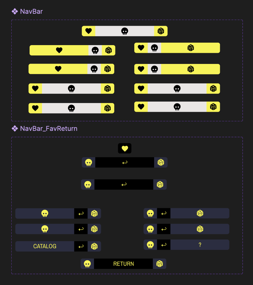
I experimented with different palattes and fonts combinations. Ultimately, the strong contrasting grey and bright yellow better emphasizes the deadpan humor. That and the grey being the color of bones.

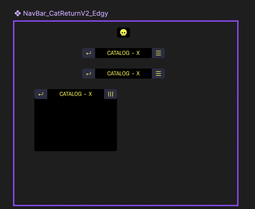
The central element to my idea is the responsive and minimalistic navigation bar; it has to be constant but evolves when the context changes. Just like the memes themselves: the images are the same but their meaning drastically changes in respond to the caption or the larger context. The goal of minimalism brought on a lot of challenges in optimizing readability and the fluidity of the interaction.
My original layout for the archive page was a responsive map that automatically pans following the cursor. I tired really hard to make the interactions and animations work, but in the end, this idea turned out to be too complicated and time-consuming at the time. I had to give up on it and pivot, but the map idea was definitely archived into the backroom in my mind.